Define
In our day to day lives we face many problems such as: remembering where you placed things, what instructions a friend or family member give you to feed their pet fish while they are on holiday (believe me it can get more complicated than it sounds), remembering what someone said during a business call and then losing your notepad that you written your notes on.
We have all been in one of these similar situations (especially me nearly killing my uncle’s tropical fish). So, you’re possibly asking yourself how can I fix this. How can I remember not to nearly kill my uncle’s fish, How can I access my notes I’ve lost, How can I remember where I put that pen and paper to write down that phone number to get that dream job and show I’m actually prepared when they have spontaneously called me at dinner time in the evening.
Approach
The approach for this project was quick and dirty. This methodology is focused on getting a quick easy results with the minimum amount of time and minimum the minimum amount of resources. To measure this solution, we are looking at how much time it reduces in terms of convenience. In this approach I will use methods such as Surveys, User personas, User journey mapping and KLM analysis.
Research
To firmly understand the need for such a solution, I carried out primary research on a small user group of 31 anonymous users. The only demographics that I gathered were the age group and their gender.
From the first two demographics we can see that there was equal both female and male users who taken part in this survey, there was even 1 user who identified as other. In the age chart we see that just under 50% of the users are aged between 18-24. The next biggest group is users aged between 45-54. This is followed by users aged 25-34 these 2 demographics together make up roughly around 40%. The rest of the age groups make the other 10%.
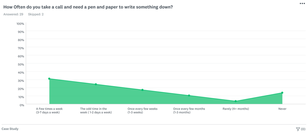
In this graph we can see how often a user needs a pen and paper to write something down while taking a phone call. We see that within 1 week 55% of users need to do this. We also see that just under 20% of users need to do this once every few weeks. Just above 10% once every few months. Then we see the graph dip to its lowest point at around 5% for rarely. Then back up to around 12% for never.
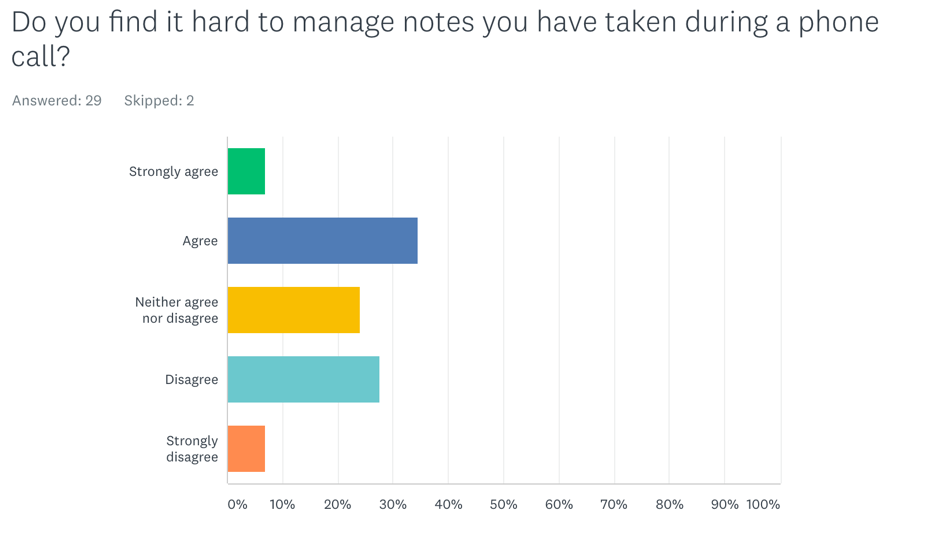
This question as you can see has split the users. Around 41% of the users agreeing in favour of them struggling to take notes during a call. Around 34% disagree with finding it hard to take notes during a call. Finally, 25% neither agree nor disagree.
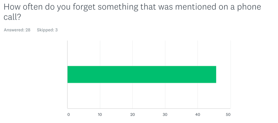
A statistic that stands out during this survey is that 46% of user forget something that was mentioned to them in a phone call. The only drawback from this question is it isn’t precise enough in its detail. Although it does highlight that this is a problem.
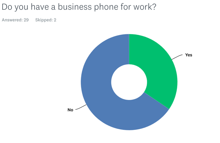
There is around a third of users who do have a works phone. This question is not specific enough as this could be a landline or a mobile phone. It also doesn’t consider the status of the user as they could be in education, unemployed or retired.
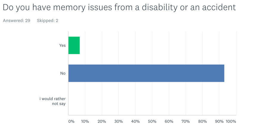
We see that 2 users out of the 29 that answered actually suffer from memory issues. This highlights that some users may have problem trying to remember things from calls.
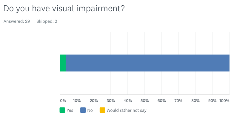
Out of 29 users who answered only 1 said they had a visual impairment.
“The results were extremely surprising. I didn’t think the issue was this widespread for the sample size. Yet the issue hasn’t been addressed.”
Emphasize
To further understand the problem, understanding the findings in greater detail is crucial for successful user centered design. Apple were one of the first companies in the world to focus on the user centered design. Steve Jobs and Jony Ive’s partnership for two decades made Apple a trillion dollar company.
“People don’t want to buy a quarter-inch drill. They want a quarter-inch hole. Why does the user want the hole in the first place? If it’s for bookshelves, why not create shelves that do not require drilling into the walls? Or, to go further down the chain, why not create books that do not require bookshelves? (e-books)”
Don Norman
User Personas
From the research gathered, it become clear that there was a mixture of different user groups. To help Decipher the feedback I created user Personas based on the statistics from respondent’s data. Survey monkey is a great tool for carrying out user research for surveys.
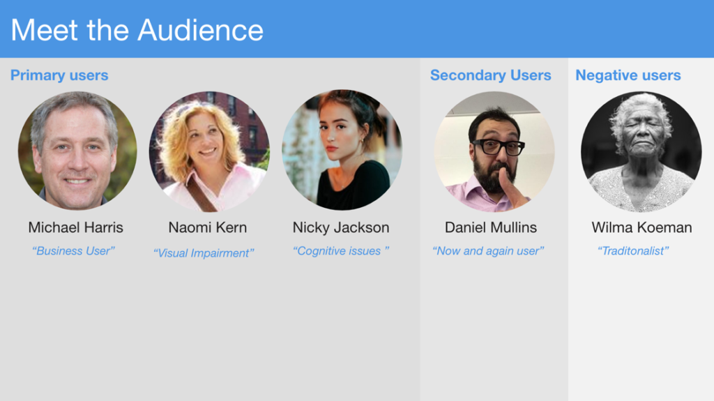
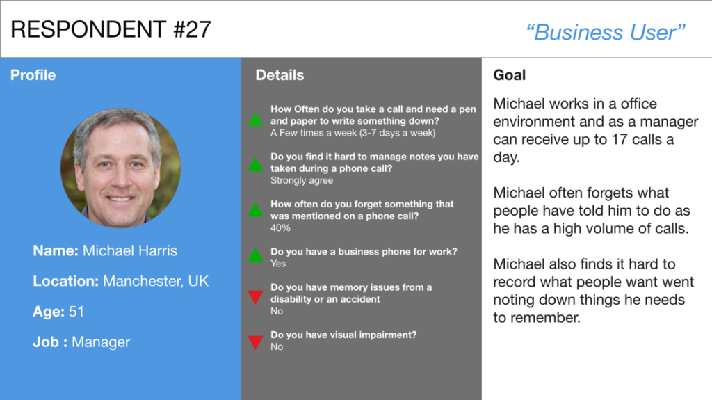
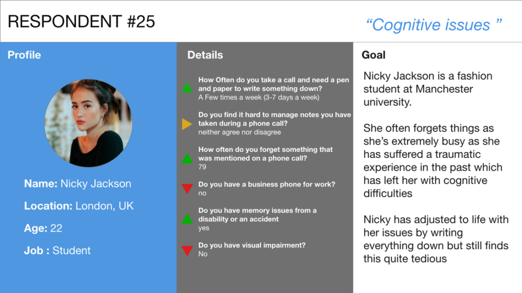
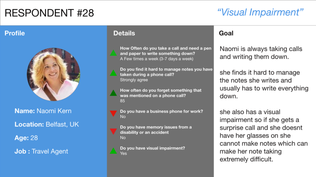
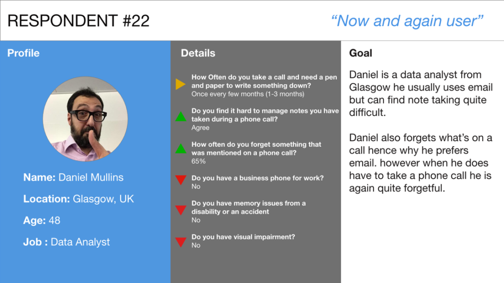
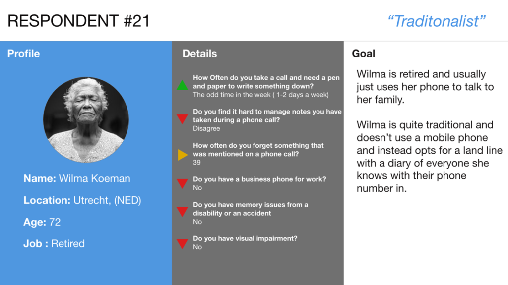
From the results its clear we can see 5 different user groups. Each user group has different needs and desires depending on their background.
User Journey Map
To understand the struggles a user might go through I created a user journey map (UJM). An alternative to this is storyboarding. I prefer UJM as it breaks down each section into more detailed segments. This allows me to understand each segment of a process more precisely.
I picked Naomi for the UJM. I believe from her persona she matches a broad array of the issues faced. Following her journey will depict a fair share of the issues faced by users. It is important to remember you can do this with multiple user personas to get a more precise representation.
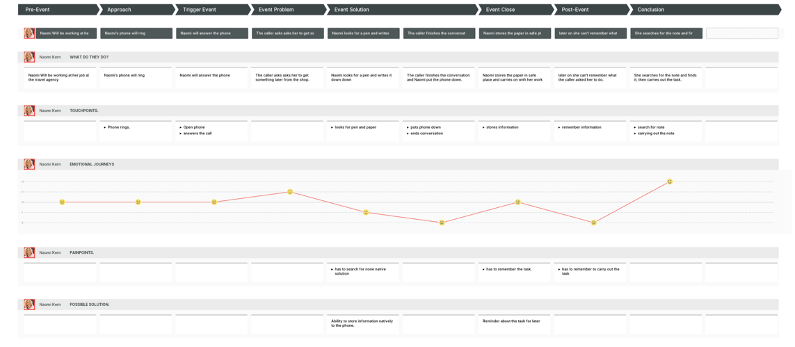
Understanding user behaviour
From the UJM there are a circle of the problems that evolve from the solution not being native to the device itself. If you have ever read Don Norman’s book “The design of everyday things” Then the brain goes through many subconscious decisions during a decision making process also known as “the seven stages of action”. This is a perfect example of when a person is asked to carry out a spontaneous task almost immediately. An important note is that everyone’s brain is different and everyone’s thought process is different.
When a user is asked to do something spontaneous we can assume that they will not carry out seven stages of action. Instead a user will carry out what is called “event driven behaviour”. This includes how we perceive the event that takes place, how we interpret what we see what we perceive and finally comparing what we interpreted to the result we wanted.
When a user doesn’t get the desired emotional response this affects their emotional state negatively. Everyone’s emotional states are very different, this can depend on a variety of different factors such as environmental, physical and mental.
KLM analysis of traditional procedure

I decided to carry out KLM analysis as it was a crucial part of my approach for increasing efficiency for this process. The KLM analysis is quantitative data technique. It is used to understand how a user would interact with the traditional process of taking notes from being asked to on a phone call.
This gives a specific time of an estimating how long a user will spend on each segment of the process. In total the average time taken was exactly 180 seconds which is the equivalent of 3 minutes exactly to carry out the process. The shortest being 110 seconds (1:50 minutes) and maximum of 270 seconds (4:30 mins).
It is important to remember this can be very different in many different scenarios but based on the scenario of what Naomi our user persona went through we can see that this is the duration of what it may of taken her.
Concept
We now have a clear understanding of the problem, it is time to turn our attention to making the solution. In order to to make sure that the correct solution is made I have decided on a 4 step process: Brainstorm, solution, SWOT analysis and control flow diagram. This acts as a waterfall method, if it works go forward a step if it doesn’t then go back a step.
Brainstorm
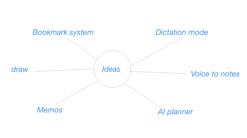
I brainstorming ideas of anything that sprung to mind that was relevant to the solution. It didn’t have to be 100% perfect to work, but it had to be relevant it was to the outcome.
Solution
The answer is “minute” the definition of “minute” is according to google dictionary is “a summarized record of the proceedings at a meeting.” noun: “Pat is taking the minutes”. Minute uses AI and apple dictation mode to enable users to have more productive phone calls. Enabling “minute” this will record what a user is saying and stores it in an app. This is similar to memo app but taken directly from a phone call.
From a business perspective, this can allow telephone meetings to be recorded and processed into an app thus improving productivity and efficiency. Users no longer have to focus on taking notes and can just focus on the conversation. This would lead to a greater appeal for iPhone as a business phone.
It improves the quality of life for those who have cognitive disabilities increasing accessibility. This results in assisting users in remembering things that they may have forgotten. It can also help those with a visual impairment to hear what has been recorded as well.
SWOT Analysis
SWOT analysis played a role of being able to minimise the risks. I discovered from the SWOT analysis that the solution was worthwhile and there was minimal threats. There was a few weaknesses but nothing major, as the positives outweigh the negatives.
| Strength | Weaknesses | Opportunities | Threats |
| Native to device. | Not compatible with other devices | Ability to open up new markets such as a business phone. | Could be used to deemed intrusive with users potentially spying. |
| Cost efficient. | Deemed intrusive | Could be used to record information to help criminal proceedings. | |
| Increases Productivity. | Already similar technology but not native. | ||
| Increases accessibility. | |||
| No native ability available on market apart from dictation. |
CONTROL FLOW DIAGRAM
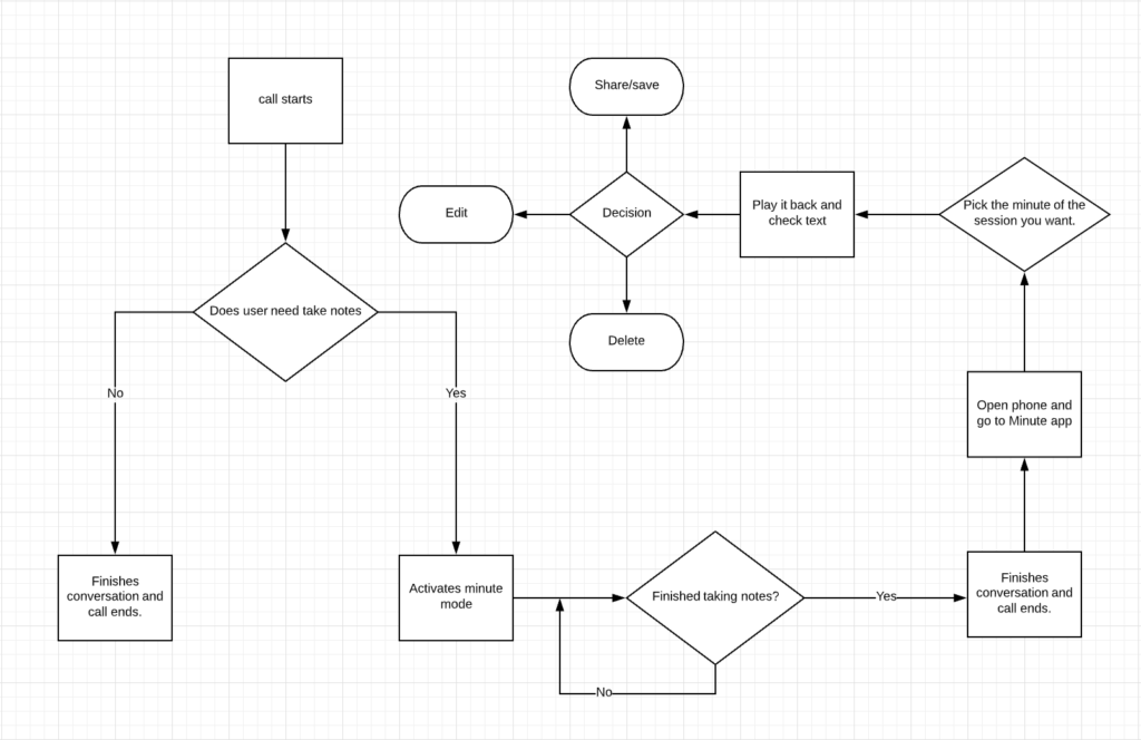
A control flow diagram is created to visualise the journey that a user may go on. This is gives the idea of how the user may use the app. It also allows additional features that may not of been thought of to be added. An information architecture was optional, however for the size of project I don’t believe it was necessary. An information architecture would be much more beneficial in my opinion on larger project.
Design
When designing for Apple it is important to follow the Apple human user interface guidelines. This means following a strict protocol when designing any developer or designer has to follow.
Wireframing
Wireframing is a fast and easy low fidelity solution. It allows a prototype to display placeholder information and show where information would go. I prefer doing this digitally as the information can be converted to high fidelity rapidly compared to paper. You could even argue that if done digitally it’s more accurate.
Catch Twenty two
The first course of action was to add a button for users to be able to trigger during a conversation. I was stuck with a catch twenty too, either use an outside button on the phone such as power or a sequence of buttons to activate minute as the user wouldn’t have to remove the phone from their ear and can continually talk. This also results in buttons being pressed accidently during a call which could trigger or end the minute mode. It is also an unambiguous affordance which is a negative user experience. Few users don’t know how to use all of their phone and tend to just muddle through to know how to use it.
Having a button is a strong signifier, this provides an instruction to the user allowing them to trigger it. It is completely obvious, however a user must remove it from their ear to activate minute.
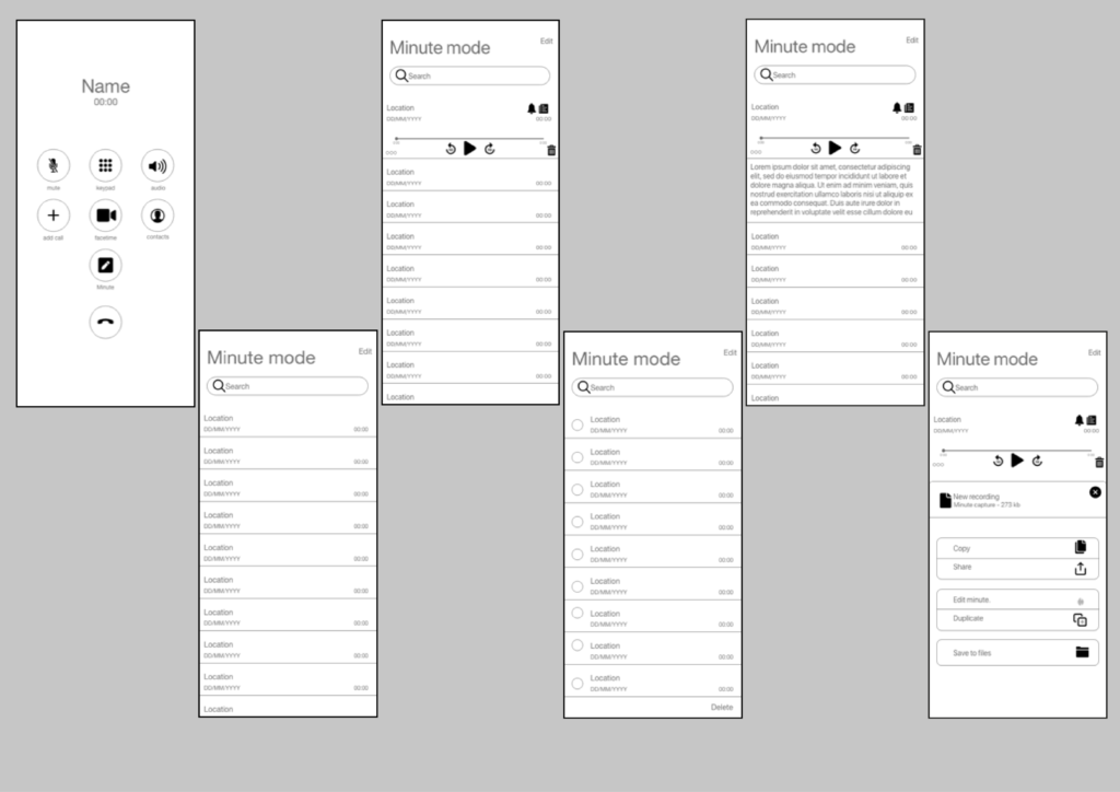
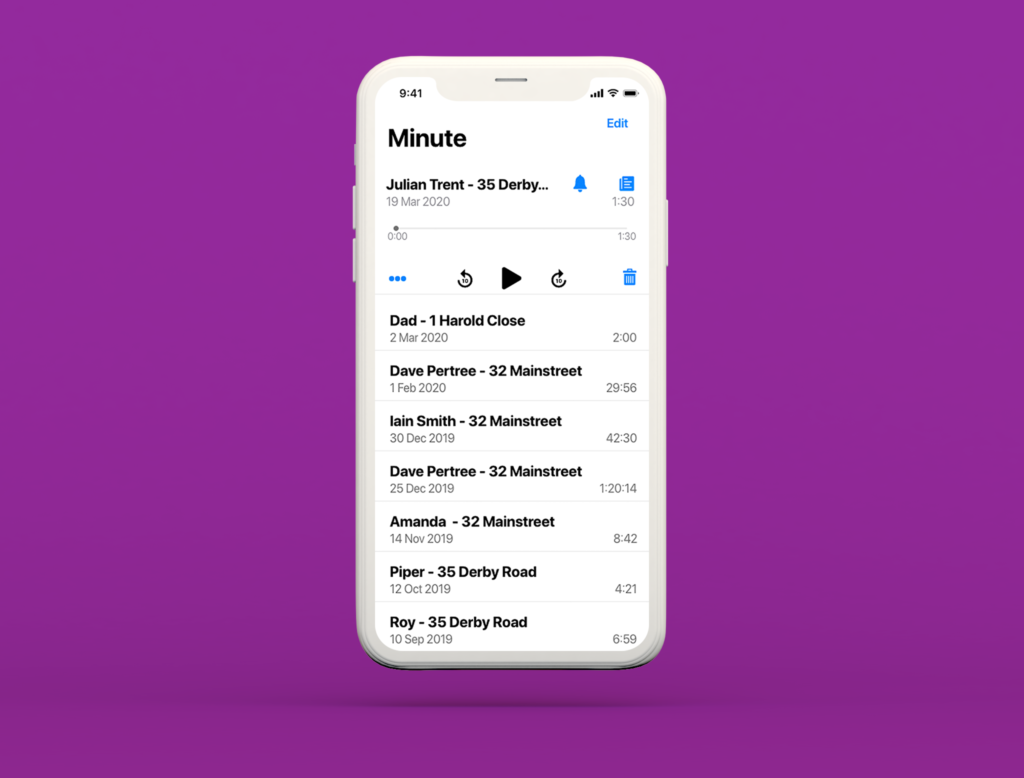
When designing the page actual app page, I based a lot of it of memos. There are 2 strong reasons why I did this, the first being familiarisation. Users have to learn to use an app, however if users have used memos before or at least looked at the page then they should find the ease of use thus reducing learning time of how to use the application. The second reason being its low cost. The code has already been written except some extensions that will be needed to make the app unique.
The basic functionalities still stay the same for editing just to keep the app familiar.
When an item is selected we can see that it extends the same as in memos. There is a difference as we can see 2 new buttons. The bell button to allow users to set notifications to allow a user to remember to carry out a task. Alternatively they may need to be reminded of that minute.
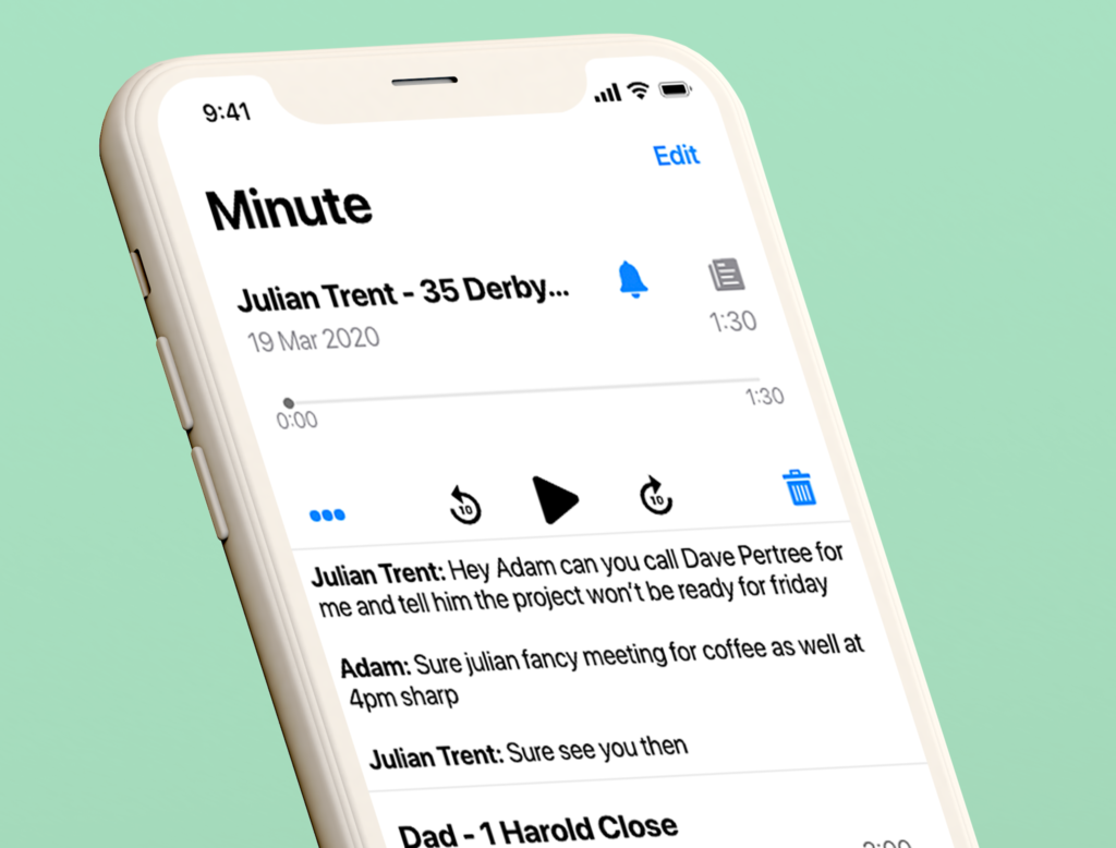
The second button is similar to dictation mode which is an existing feature. Dictation mode converts voice into text on apple products. The problem is there are 2 people in a conversation. This will require AI to determine who is talking. This will then be able to determine who is saying what on the output.
High Fidelity
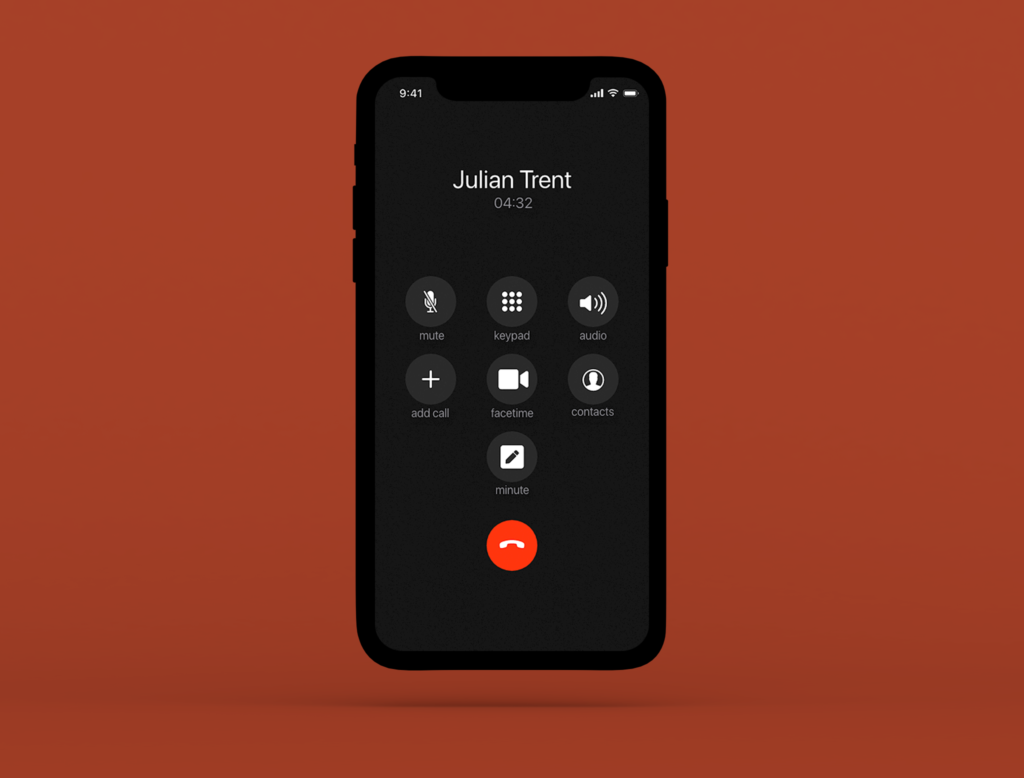
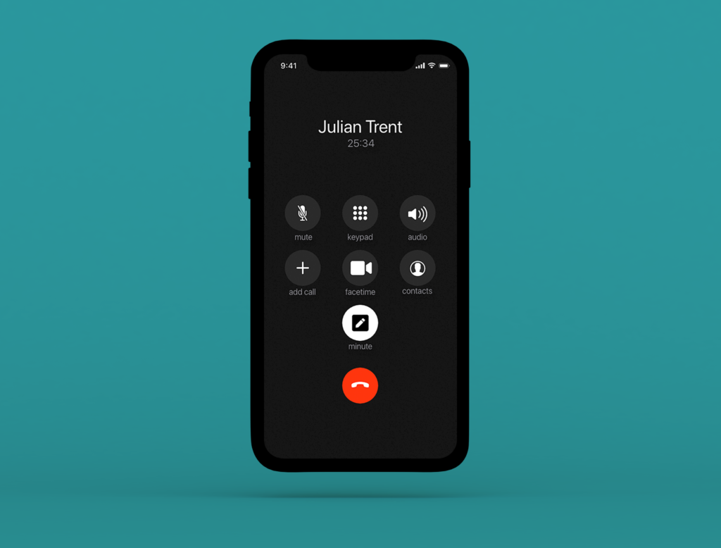
When In a call on any iPhone this screen is consistent across every phone. we can see that the minute mode button Isn’t selected in the first but in the second it is on. This is highlighted by the colours being switched to white rather than a grey to alert the user that they are taking minutes.
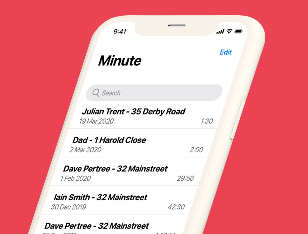
Following the design principles of the memo and Apple human interface guidelines, I thought it wasn’t important when in the list to keep the user informed of who you were talking to and the location of where you were when the minute was taken as a default. Humans are naturally lazy and don’t want to rename things so having that as a default will allow them to find what they want much quicker.
We can also the date that the minute was taken and if this was on the same day then to would be reverted to the hour it was taken. To the right we can see the length of the minute.
When edit is selected the list adjusts right to allow the check boxes to move in as well as the delete button at the bottom.
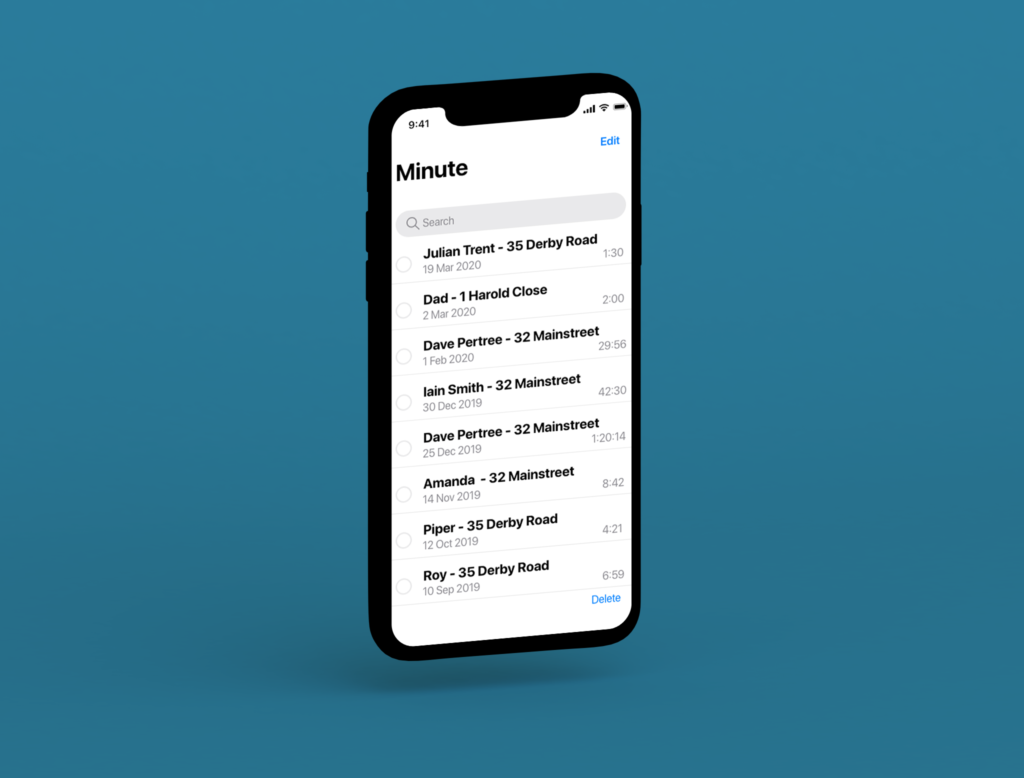
When a list option is selected or you move down the list the search bar disappears to increase maximum visibility for the list. All interactive functions that enable a menu to open are listed in blue as this is part of the Human interface guidelines. If the text is to long it will shorten to give the buttons space. The text will animate to show the title of the listed item.
We can see the minute text conversion in this image, we can see that the button greyed out to tell the user they are using that function. The AI can detect the users voice and will be able to distinguish this between another user’s voice in conversation. However, if this isn’t completely accurate there is a voice recording of the conversation as well so the user can make amendment’s if it isn’t completely accurate. This will allow users to playback the conversation so they can remember key details if they have forgotten such details.
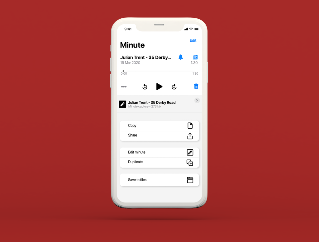
The meatball menu provides information about the minute. It will also allow users to copy and share the minute with team members or the other user on the other side of the phone. You can also edit the Minute this way by changing the text and name of the minute. You could even duplicate the minute if you intended to have 2 different versions. I you have Apple Cloud and use it regularly then you can save it to your files so it will be available as a record, however as apple relies on iCloud massively this could be accessed from multiple devices from 1 account i.e. iPad, iPhone and iMac. There is also an exit button that allows users to leave the menu.
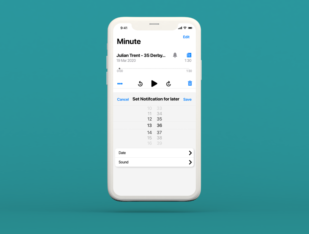
If the bell is selected you can set a reminder for a user to come back to the minute if they need to carry out what the minute is about at a later time. The Timer is built around Apple’s existing timer setting mode in alarms except with noticeable differences to the colour scheme as that one is dark to reflect mood such as night time and people setting them for bed where this is setting it to be reminded of a notification on the app so follows a more generic colour scheme. Too notable changes that are made are 1) a date selector has been added to allow users to select the date for the notification and 2) sound so they can pick a distinctive sound for different minutes. Everything else has been scrapped as it isn’t needed.
Validation
KLM Analysis of New process

KLM analysis is carried out the quickest result recorded was 92 seconds (1:32 mins). The average time taken was 160 seconds (2:40 mins), latest time was 250 seconds (4:10 mins).
to compare the process of the new digital process and the old traditional method. When measuring the traditional we can see that the new method averages 160 seconds which is 20 seconds quicker. It may not seem a lot but as humans are naturally lazy and want to do everything as quickly as possible. Between the quickest time there is 18 seconds difference and between the longest times there are 20 seconds. If you’re continually doing this everyday, the seconds mount up.
Usability Test
To validate the design usability testing was done remotely with a user via webcam and screen sharing. A user persona that suited the user was assigned to the user in this case we assigned Naomi for confidentiality reasons.

After carrying out the testing a user journey map was created from the notes and recordings. We could see that the user is much more satisfied compared to the traditional method as this method is much more intuitive.
Conclusion
Overall I believe this project went extremely well. Although it not a massive project and its relatively small, I believe it could change the lives for many people with accessibility issues and to increase overall human efficiency.
I am happy with the all of the tasks I have chosen, I believe they was the correct tasks for this project to be successful. I have learnt a fair amount about different methods and how unpredictable the results can be from surveys, as I didn’t expect that many people to suffer that much from the problem.
A future improvement would be to have it more rigorously tested. this would ensure that all possible angles are covered. Steve Krug in his book “don’t make me think – revisited” talks about constantly testing usability for the best possible user centered design.

