IRIS
Information For Railway Station Staff
In August 2020 to March 2021, I was assigned to the Information for railway station staff (IRIS) research & development team at Liverpool John Moore’s University (LJMU). The Project was ambitious and innovative – the first of its kind – funded by the department of transport and the UK Research and innovation (UKRI). There has been growing consumer distrust due to the impacts of the failed franchise model as a result created a confusing pricing structure and allowed poor service quality. With the goal of restoring trust in the industry the government created The first of a kind competition 2020, which allows businesses or organisations to bid for funding for new innovative technologies to be produced and used by the railways industry.
All opinions/views in this case study is my own and does not necessarily reflect the views of Liverpool John Moore’s University or Mersey Rail.
The challenge
My role
I was part of a small, dedicated team of four, which was further backed by a support team which consisted of a full stack developer, a data scientist and project lead. My role was to handle everything user experience, the user interface design and the user research. I lead the team through the process from start to finish. I worked closely with a project manager, front end developer and a back-end developer.
The approach
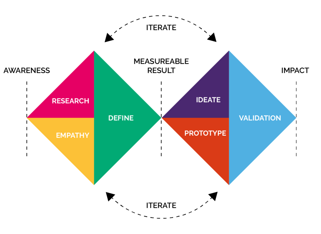
The chosen approach for this project was a lean UX approach which focuses primarily on learning from each iteration while also aiming to create a minimum viable product (MVP). The double diamond lifecycle was used for each iteration, this maximised learning while contributing to an MVP. The double diamond fitted in through a dual track agile process which worked harmoniously with the development team between sprints.
The problem
The current landscape in the railway industry is negative and when disruption occurs frontline staff and control could have up to a thousand phone calls a day. In addition to this there is a lot of noise which affects how people interpret the information they receive when disruption occurs. As a result passengers are left in the dark about what is going on. Furthermore control don’t know how many passengers are in the stations either during busy periods so passenger management can be varied.
Tyrell communication system only offers one-way messages to staff, which does not satisfy the stakeholders (MerseyRail staff) needs, furthermore there are up to seven different sources for different railway information including the Darwin system which is industry standard but is prone to going down as the information isn’t very accurate.
Our solution
To make a successful data integration system by taking multiple sources of information and connecting them, making MerseyRail’s operations much smoother. To help staff during disruption, a 2-way communication mechanism is compulsory for all levels to communicate effectively. Having the ability to rapidly relay information to passengers about disruption is a must.
We have also installed internet of things (IOT) sensors at platforms in numerous stations as a result, this will allow passengers to be counted. Stations will now know how many people are in a station when disruption occurs, and how many rail replacement buses are needed.
In addition, we spotted a problem that wasn’t even thought of by MerseyRail which was passenger assistance as it was currently all done by
During our research , we spotted another issue that become apparent which was passenger assistance as it was done by paper and phone calls to stations in order to book the assistances. We created a system that allowed staff to digitally assign visually impaired passengers and wheelchair users and other passengers that require assistance to journeys.
Initiate
Goal orientated design
Prior to beginning design I made the trip to Liverpool central station to carry out user research on how current day to day operations were carried out. I spent majority of the day shadowing different members of station staff seeing how they operate as a team and understanding where the pain points and gain points are. Shadowing is goal orientated research method which strictly looks at the goals of the user and what they want to achieve. Shadowing is great method as it doesn’t stress the user or allow them to act out of character because they are in a natural environment.

Discovery
The first thing that stood out to me is if this is going to be for platform staff, they shouldn’t have to hold a tablet or mobile and instead should be attached to them through the forearm, hip or lanyard as they are always picking things up such as ramps, radios and various other things when helping customers.
I spoke to one member of station staff who was giving me a brief discussion about different reasonings behind different categories of disruption. Depending on time a rule of thumb anything that is 1-3 minutes late is because the train is usually waiting for someone to get on as it’s departing.
I found the worst-case scenarios are fatalities and trespassing on the track which result on the power on the track having to be turned off and this is when rail replacement and alternative routes are put into action. It became apparent that they were using WhatsApp to communicate when disruption occurred. Each account was a station, and they would sort out their communications this way. One major issue is though, it’s a third-party application and can be susceptible to down time.
Signal, train and track faults are another issue that was highlighted but this is then time dependent on what the issue is. Compare this to fatalities and trespassing which could shut the line down for a morning or an evening. Signal problems, train and track problems are all debatable on what the issue is as this could be anywhere between 10 minutes to hours.
Staff often take turns on rotation of helping what is called “VIPs” (Visually Impaired Persons) and people with accessibility issues. This requires a phone call to be made. This is to be written down logged by a station. Next, they have to go to a certain carriage to meet the person and assist them. However, I witnessed a pain point of communication when a VIP was meant to be on a certain train, and they were not there. This created a lot of noise and confusion it then taken 10 minutes for the other radio user to respond. Eventually they found the person of interest and they were helped off. The general rule of why this happened is because as humans we can analyse roughly 60 words per minute when we listen. When we read, we can analyse 300 words per minute. Sound is also a lot easier to be affected by noise and external factors such as accent, speed and quality connection.
This brings me nicely onto the next topic designing for accessibility. The problem with reading is that it some staff may have visual impairments such as colour-blindness or one staff members case dyslexia. There are 3 ways to fix design for this. The first is using colour such as a traffic light to signify how bad a problem is. Second is using symbols to signify what the issue is for example using a wheelchair icon for assistance, and then using numbers to signify severity using a score of 1 for minor, 2 for major and 3 for critical. The final way is using sound potentially to alert users to anything that has appeared on the device. Sound is critical for diverting attention to something when it needed such as in hospitals when an incident has happened to alert medical staff to an issue.
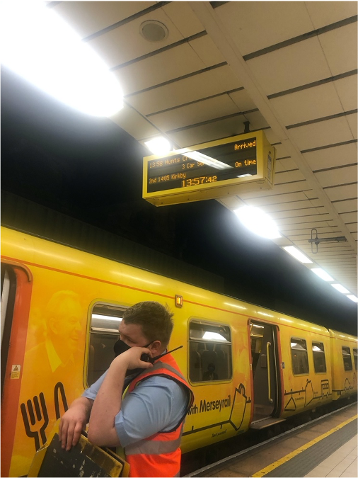
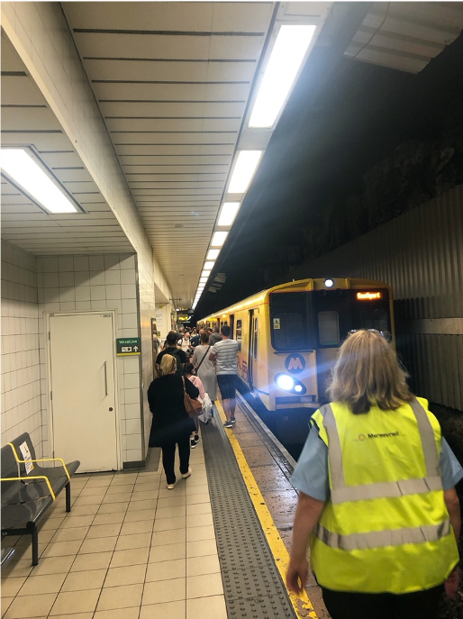
There is currently no mention of how many cars a train has. I believe this needs to be added to make it more effective as during the covid outbreak there is an inconsistency of how many trains are out, so staff don’t know how many cars are on a train. In the following image we can see a station staff member having to move extra distance as they thought it had more cars and it may have stopped further down the line. This is because this information isn’t readily available which they should have it on hand.
Diving deeper
Focus group
From the data gathered from shadowing staff, I written 12 questions to ask a focus group of 5 train staff to dive deeper into what I witnessed.
Staff felt that current ways of getting timely and accurate information was poor, as skyboards are linear and are not interactive, so they only show marginal fragments of information
Staff felt communication to be restricted because of skyboards not being detailed or interactive, leading to errors and mistakes taking place. Staff felt they needed more information right away why a train has been cancelled or delayed. This results in staff having to contact numerous people to find out why and what has happened.
“We need information on why trains are delayed or cancelled. We’ve got to radio into stations to duty manager or the manager or whoever’s on to find out why it’s been delayed. Sometimes the information is good isn’t it. sometimes the information is helpful other times its bad.”
Staff found the current way assistances to be carried out inadequate, as they involved everything to be made by phone calls and logging it by paper. Paper based processes are becoming more and more obsolete as the information can be lost, stolen and unreadable in some cases.
Conclusion
There are a few major touch points to consider making IRIS a success.
- The design needs to be very accessible as there are staff who suffer from visual impairments, hard of hearing and various other problems.
- The device can’t hinder the performance of what the staff currently do as they already carry a lot of equipment. Attaching to the forearm, hip or on a lanyard will suffice for minimal negative impact on the persons performance.
- The system needs to be accurate, fast and extremely informative if the staff are going to use it. If it doesn’t meet any of these requirements, then it will not be satisfactory.
Emphasise
Feeding back to the team
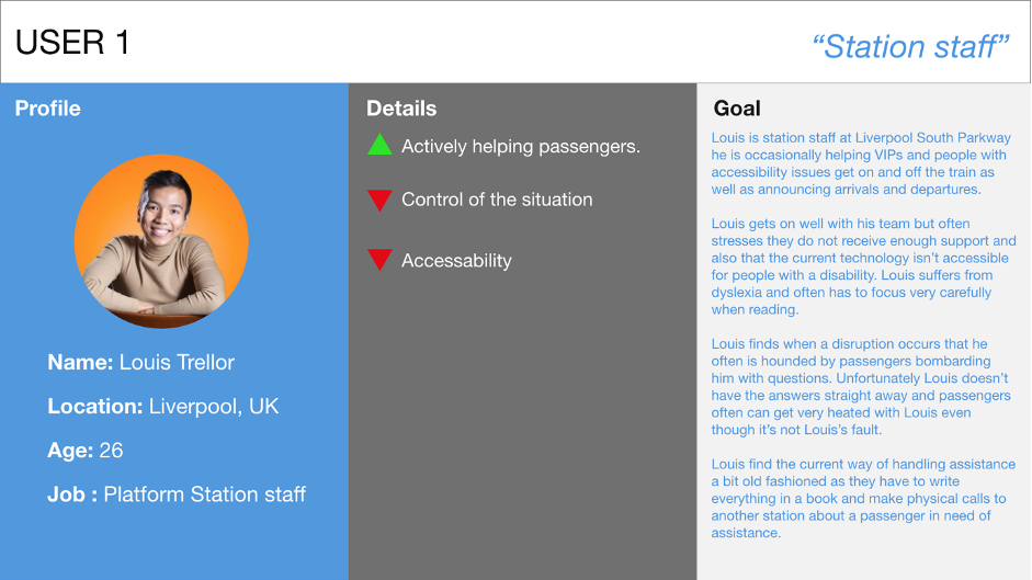
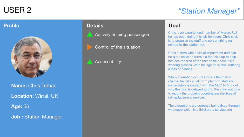
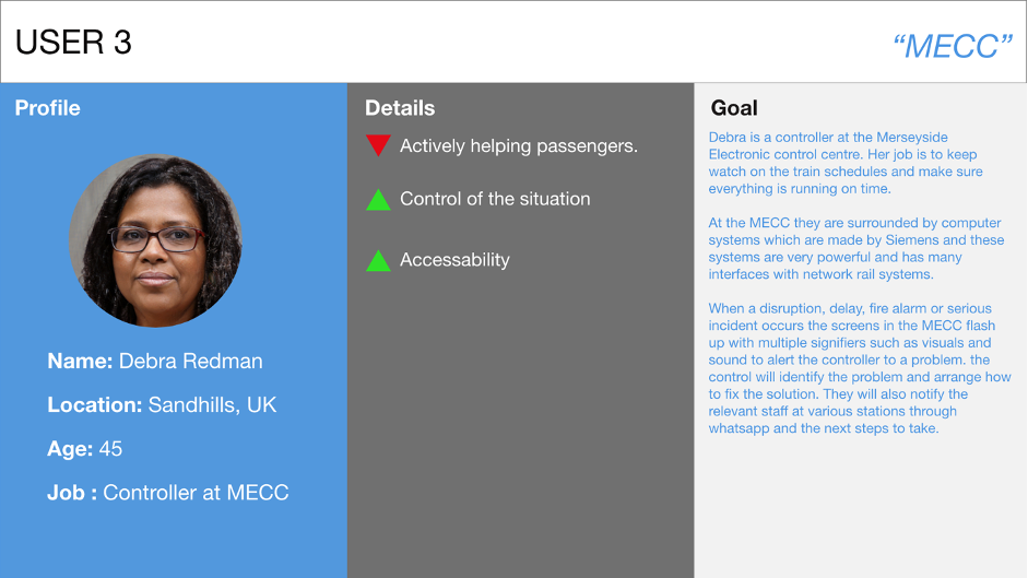
To help the team understand the problem I created user personas based off the station staff that I have worked with over the past few weeks. This helps the team create a deep understanding of the issues that the staff face firsthand and also allows the team tom have empathy for different users.
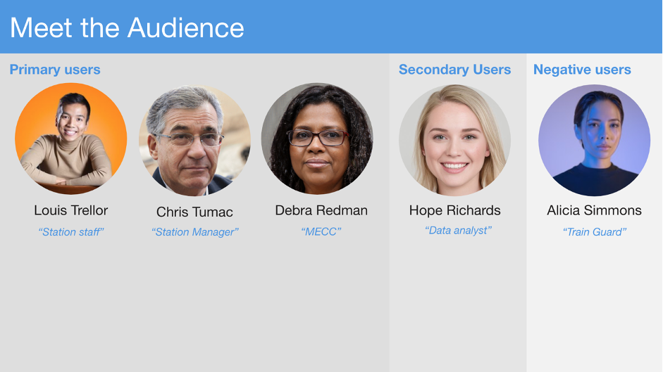
We found the 3 main users represent 3 different levels of user’s station staff (frontline), station management (management) and MECC (Control). we spent roughly 15 to 30 minutes on each primary user taking the notes that I had gathered and transforming the notes into a persona based on real staff.
Empathy mapping
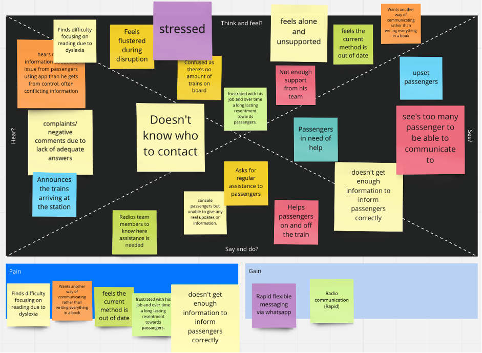
From the users stories we then made empathy Maps to try and understand what the staff may well be feeling. The idea behind empathy mapping is to allow a shared vision and understanding. This is so that team has a personal of level of understanding the problem.
User 1 
User 2 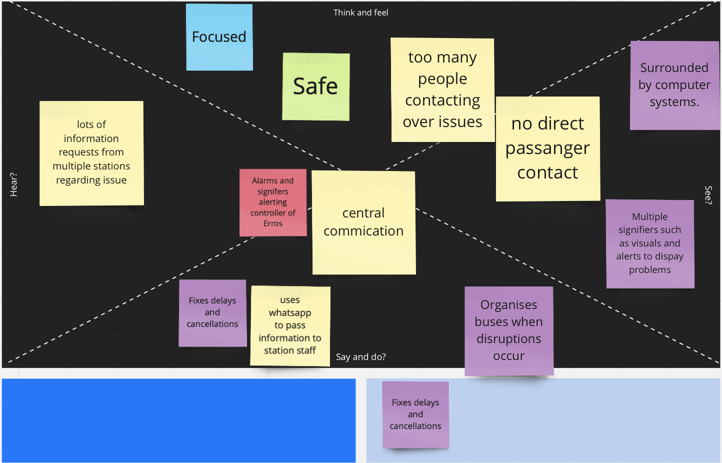
User 3
Define
Where does the problem lie?
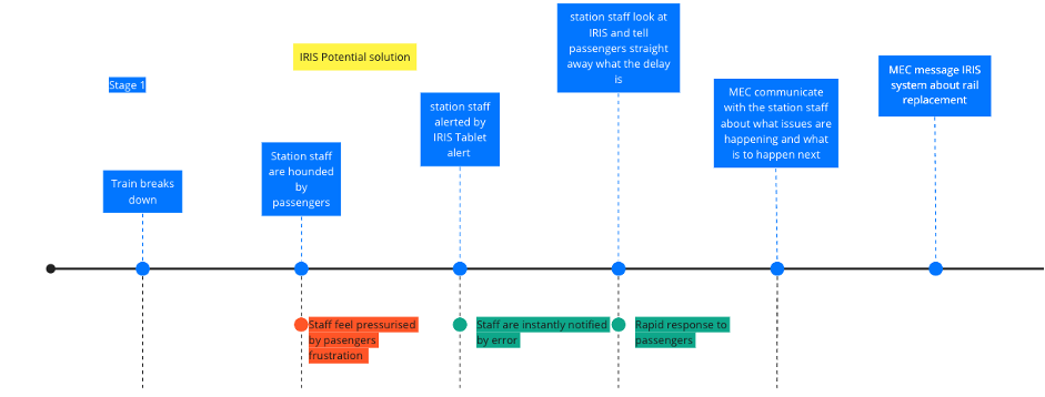
From the empathy mapping we can see the frontline staff feel the emotional pressures more than the staff at higher level. In order to see what happens I created a user journey map for when an incident happens, we used the rail replacement service as an example as this is severe case which utilises most of the problems in order to fix. As you can see there is no gain points in the current solution, and it can be pretty time-consuming leading to passengers not being satisfied.

Cutting out the middleman.
We found cutting out management and giving staff the ability to be able to communicate directly to control to be the way to make the process more efficient. I designed the process of how we think the process of when an incident occurs how it should be handled with the IRIS system. As a direct result of this process being streamlined, we see higher satisfaction in a negative situation.
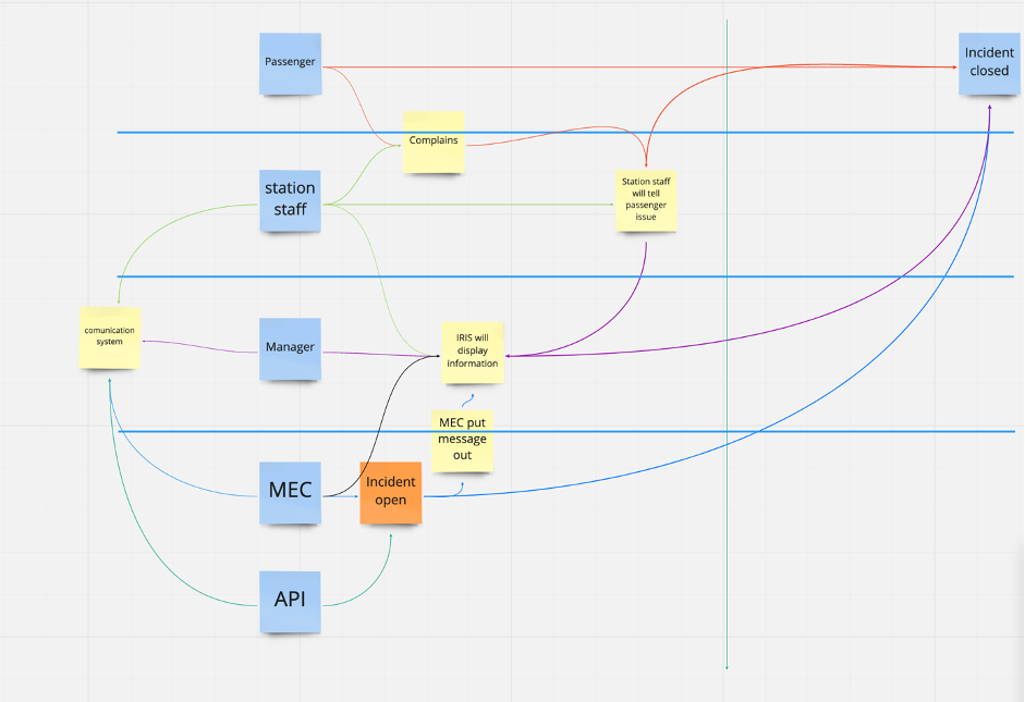
Flow of communication
In order to understand how the flow of communication works and how staff would handle communication between each other, we created this diagram. This helps visualise how the system would communicate between staff, passengers and the system. The reason for this is to consider how information would reach different parties involved in the process. By doing this we can understand who speaks to who and frequent this occurs.
How might we?
As there are many questions in the team’s mind about how to do this it’s the appropriate time to do the “How might we” exercise to get any assumptions out. The “how might we” are then broken down into themes. We then found 2 primary themes, composure and alerts. Anything that didn’t fit into these 2 categories went into miscellaneous. Composure is how to send a message while alert is displaying the incidents and messages. The team was then asked to vote on what they felt was the most important issues to them and what would be prioritised to be solved first.
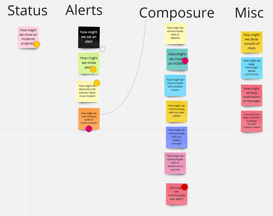
After the “how might we” exercise was completed, the team concluded that the composure and the alert are connected. To send a message triggers an alert message, these are both ends of the process.
How do we know this is going to be successful?
We believe that we will increase the efficiency for railway staff during disruptions using IRIS. This will be achieved if Railway staff can resolve issues accurately and rapidly. To successfully achieve this IRIS will be measured against the following key KPIs.
- Reduced waiting times during delays.
- Feedback from passengers who received help from staff who in turn uses the system.
- The average number of complaints over the trial period in comparison to the previous 12 months.
If these 3 key KPIs show a positive outcome we will know that IRIS is successful.
Build
Designing from the ground up
With early ideas I went ahead and created wireframe of what the app could look like. We based the initial design of OIS (Operational information System) and CIS (Customer information System) which are the railway standards.
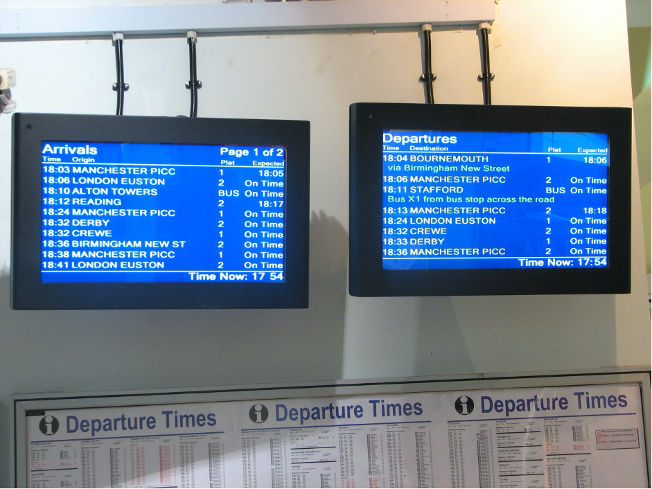
The reason we taken this approach was because we didn’t want to have staff to learn a new system. As a result, having something familiar will be better received than something they have never seen before.
Big upfront design
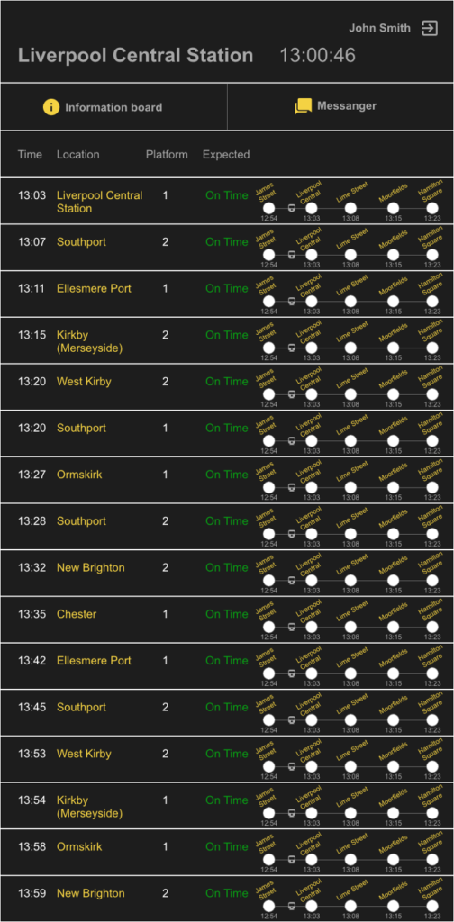
A BUD (big upfront design) approach was taken, this was to get the ball rolling for the developers. One adjustment I made was showing a visual representation of where the train was on the track. This used the logic of times and expected arrival to calculate where it would be on the diagram. The reason behind this was to be able to tell visually where the train currently was on the journey.
Sketching away
I asked the team the day before the sketch session to do some homework and research any other solution for transport solutions out there. They didn’t have to be exact or similar, this was purely to get the creative thinking flowing, allowing participants to get inspired. Participants would then spend a few minutes to present their findings to the rest of the team to a slow the team to fully understand what the solution is. In this design sprint we would be focusing on the Composure of how to send a message and display the alert.
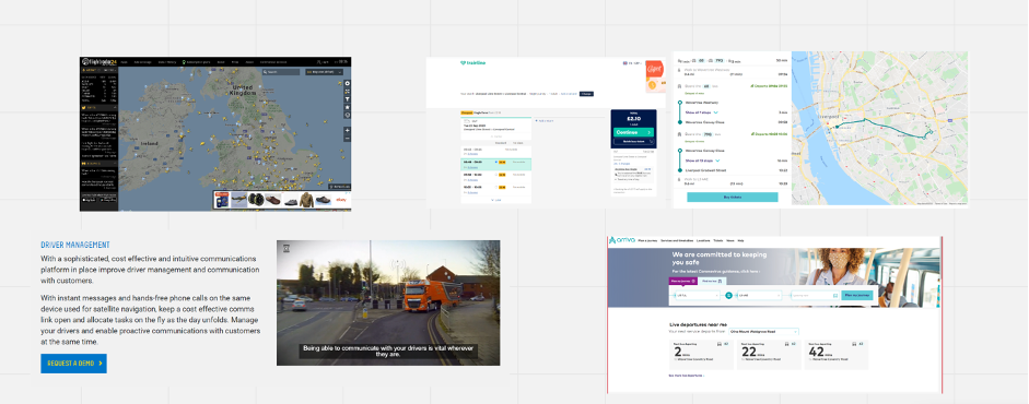
The process
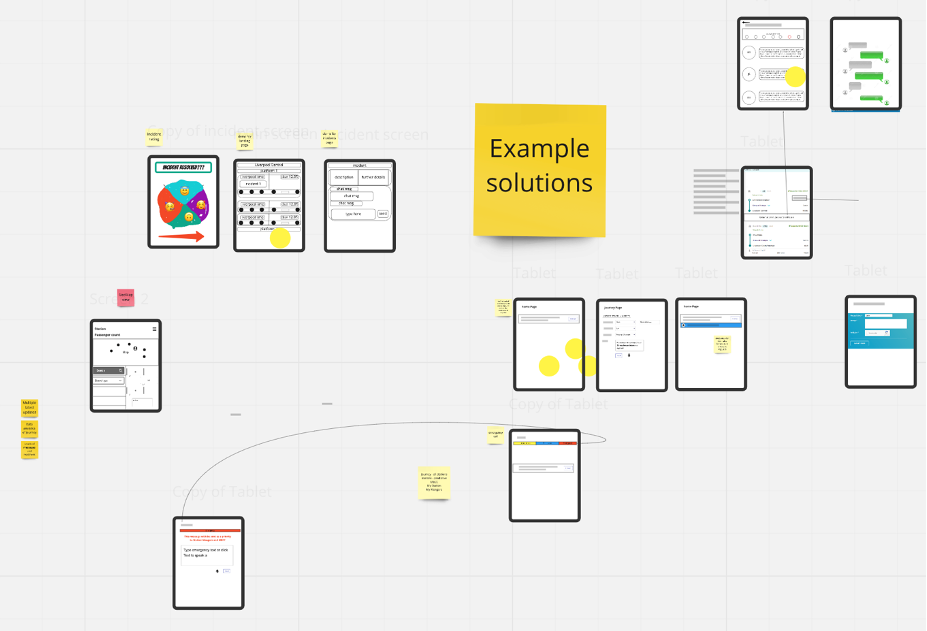
The process for the sketch session was based on that from google ventures.
- The first activity was for the team to take 10 to 15 minutes to think of ideas and take any notes, this allowed everyone to gather thoughts and take any inspiration.
- Participants then had 30-45 minutes to draw out different ideas that may have sparked.
- Crazy 8’s followed which is to come up with an idea in 8 minutes the aim is to be outside the box with this one.
- Following crazy 8s the participants then had 45 to 60 minutes to draw a final sketch.
- Each participant of the team then taken it in turn to present their concept. Soon as everyone had presented everyone voted on their favourite sketch, The Project lead having 2 votes.
The solution
The chosen solution was a form constructed on a journey. Initially the form comprised of a recipient, severity and type of incident or assistance type. We learned from this process to issue a message everything is assigned to a journey rather than having a page where you would just send a message separately. Having a message assigned to journey, the message minimised risk instead of having to write the message and find the right train. Instead, they first find the train and then send the message.
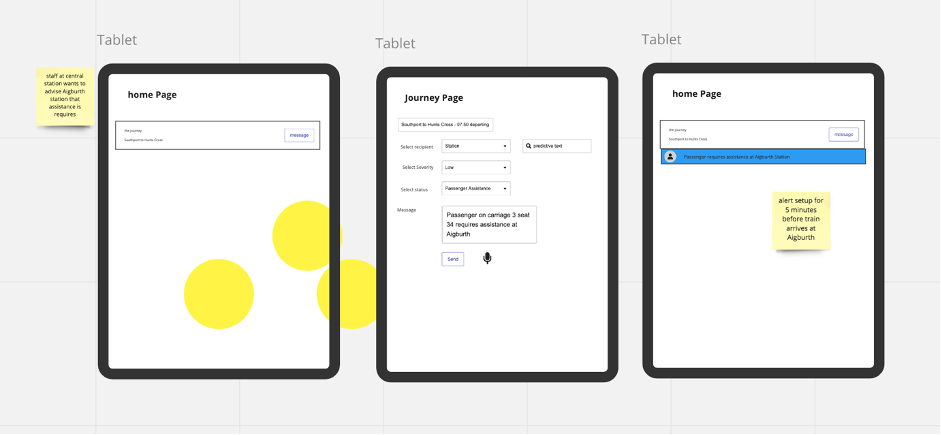
Once the form has been filled it would then be sent. to the information board, as a result the form would turn into a coded message which would then appear attached to a journey on the information board.
Communicating precisely but informatively
Early on we knew that all messages had to follow a specific code which was created. This code was very similar to those Tyrel and Darwin. Protocol exchange messages had to also be timestamped, position, streaming channel, importance of the message, who is sending the message, message itself.
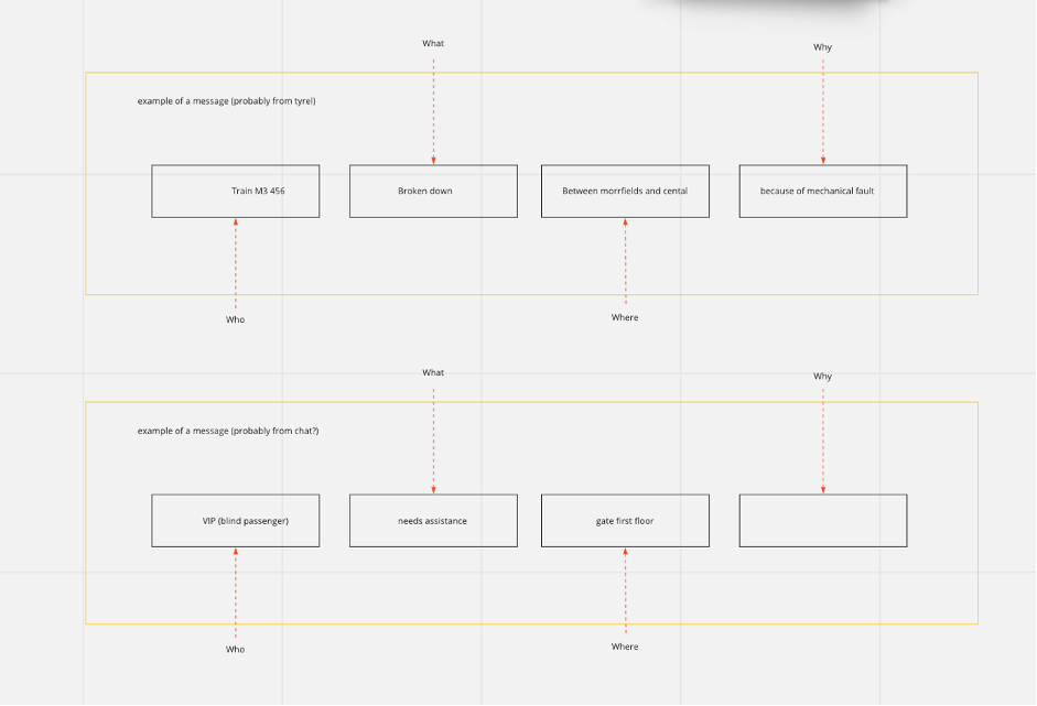
Different systems send different messages, as a result of this we had to create a standardised format. This was essential to make sure all the messages were consistent and flowed with the system. To do this we broken up the message and then put it into Who, what, where and why format. This was the template that the form staff that the staff use would be consistent with Tyrell and Darwin messages.
This is the mental model for the users, it’s a consistent message that’s easy to read and understand across 3 different sources of data that’s being integrated.
Iteration 2
Adaptation
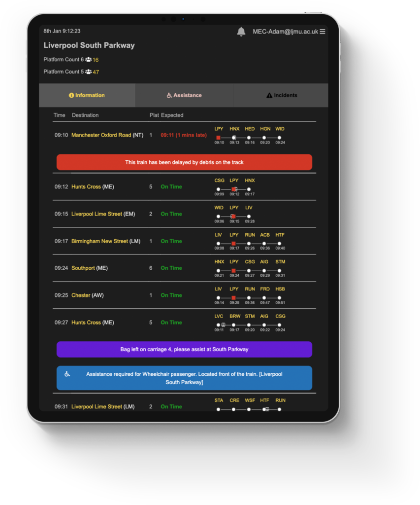
The system evolved, now featuring 3 tabs for information board, the assistance and incidents. This featured lists of ongoing assistance requests and ongoing incidents. Users could now view assistances only, if staff have been assigned to assistances only. This also allowed a way to rapidly monitor ongoing incidents. We highlighted portions of the track that are affected by an issue in red to show if there was an issue on a stretch of track.
We built at mid-fidelity design to make certain aspects of the design stand out. Most of the information in assistance or the incidents was placeholder as it was still work in progress. Goal directed design allowed us to understand what are priorities the user needed quick and easy access to.
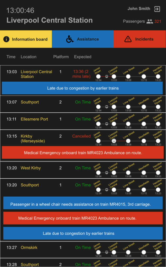
Main information board 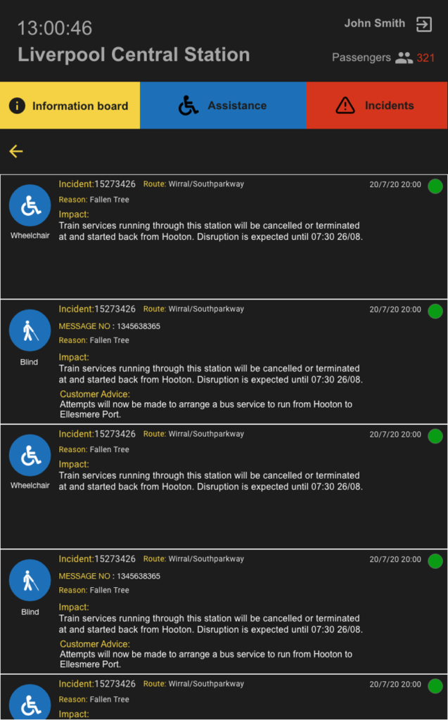
Assistance board 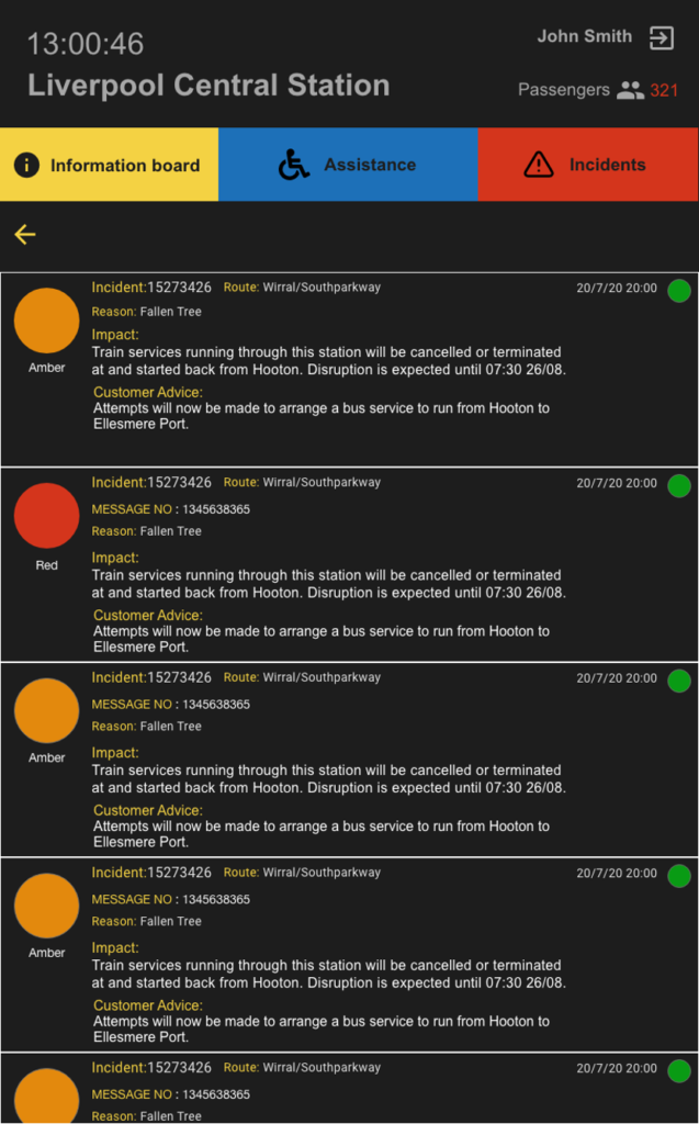
Incidents board
Sketches to Prototype
Composure of a incident and request
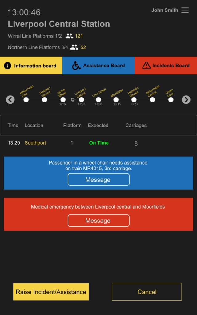
From the sketch session we concluded that the best way to raise an incident would be from selecting a journey from the information board. Once the journey is selected they could then raise an incident/assistance.
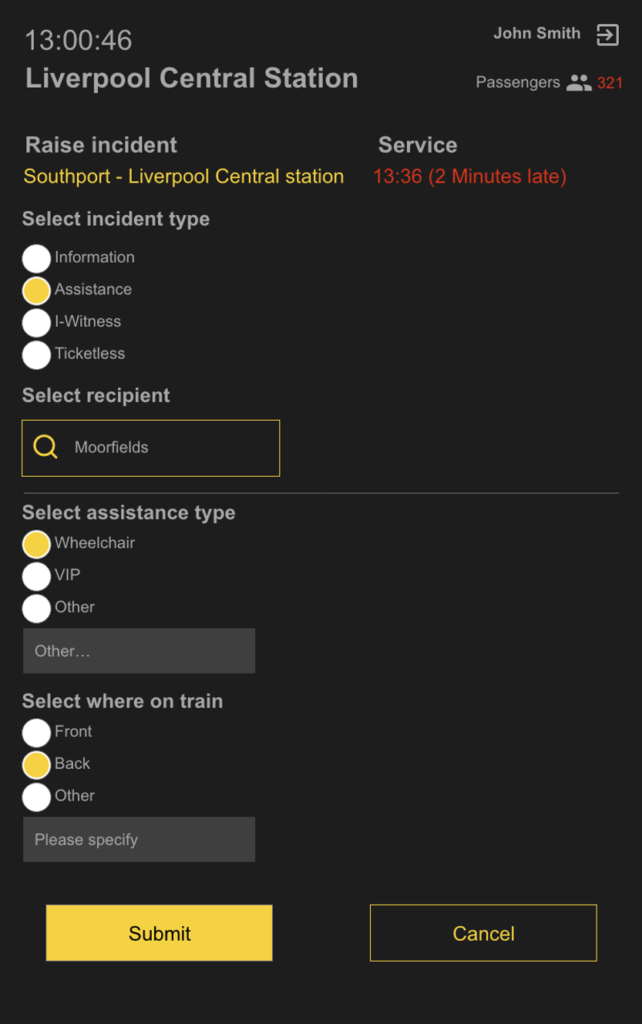
When raising an incident or assistance, we made the route visible and the service visible with the time to make sure staff knew they had the right selection.
Staff then decide what type of incident they want to raise, information, assistance, I-witness and ticketless are all classed as incidents.
In this example we see that assistance is selected which acts like a decision tree. The next step then asks what station the person is going to in a dropdown search box, that can also be typed in to speed up the process. After the station is selected the type of assistance is selected which is wheelchair, visually impaired person or other which then has a box to type what type of assistance is needed. The next step is where on the train which is usually front or back or other.
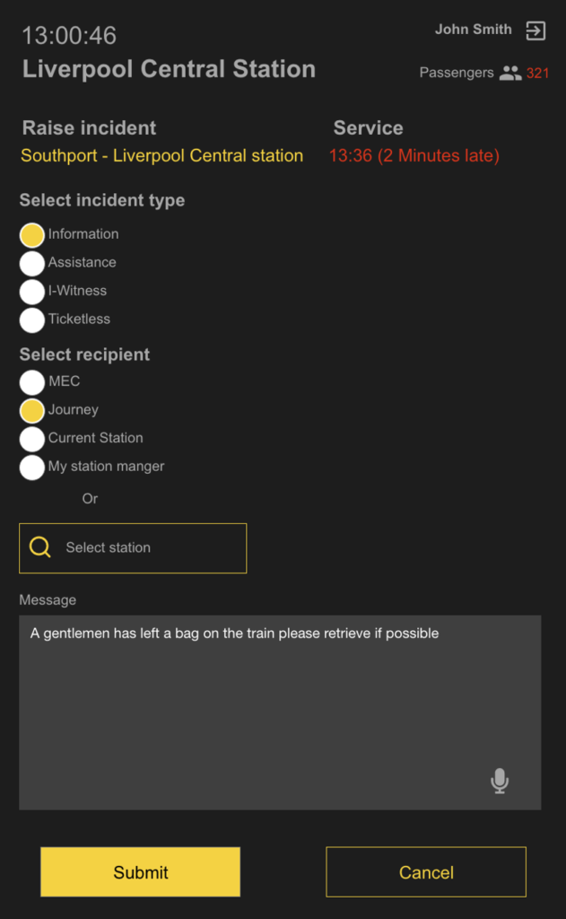
This is different to Tyrel and Darwin as its raised by staff. Information messages can be sent to a journey (all stations stops on the line), Control (MEC), Current station, specific station or your station manager. The message is then inputted into the box to submit which is then displayed on the information board. voice to text functionality was added to allow staff who may suffer from dyslexia to be able to talk rather than type will be quicker and more effective.
Meeting with stakeholders
We scheduled meetings with Mersey Rails operational management and displayed our designs to them. The management were thrilled as they could understand there was massive potential for this system to help them. However, the management team did see gaps in the communication system with who maybe receiving the assistance requests. Some stations are limited with staff or staff may suffer from a medical condition that limits them. As a consequence, its then the guard’s job to carry out the assistance. To make matters even more complicated, Merseyrail have some of the oldest stations in the world with the Liverpool – Manchester line being the first passenger rail line in the world, as a result some stations infrastructure isn’t disability friendly and cannot be accessed.
Designing for any situation
Overcoming communication barriers
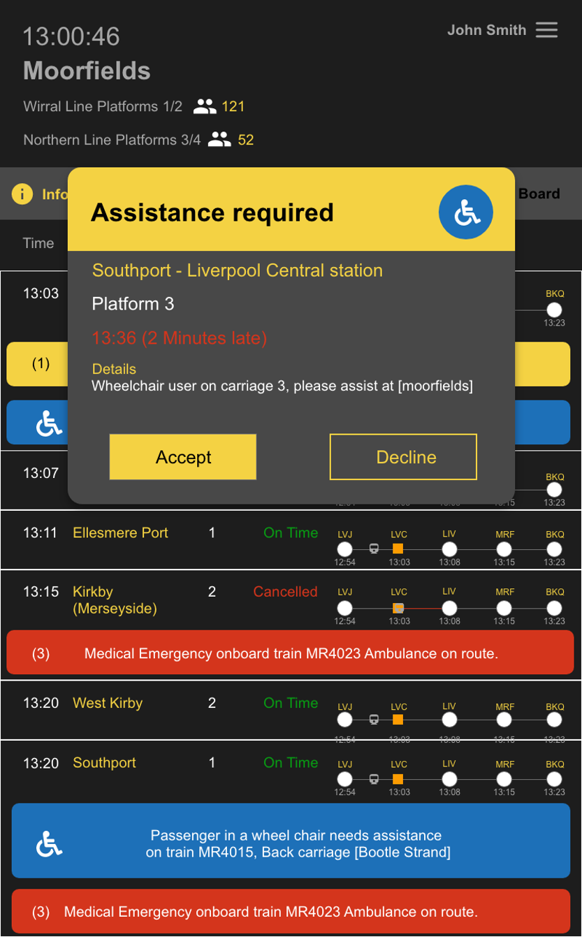
In order to meet Mersey Rails needs we added an alert system. When an assistance is sent it delivers a JavaScript alert that asks the station staff if they want to accept or decline the request. When an alert comes through it is accompanied by an alarm ringing sound.
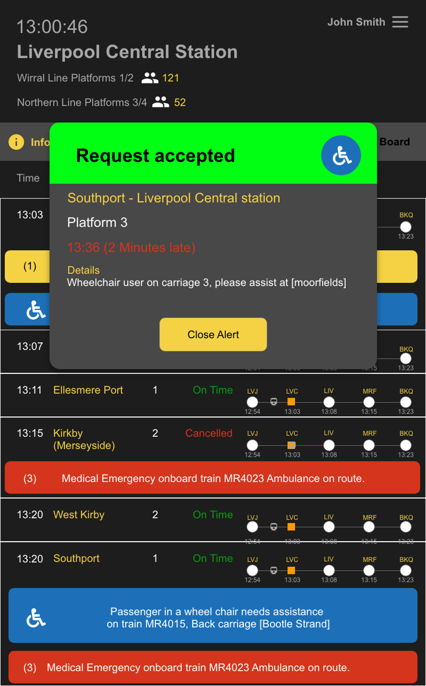
If the user selects accept, this alert will be sent back to the sender to notify them that they can carry out this action.

If the user declines, then the request declined is sent back to the sender to notify them not to put the person on this train. This would then fall for a guard to carry out the duty if they were available to.
Design for everyone
Standards of Incidents and assistance
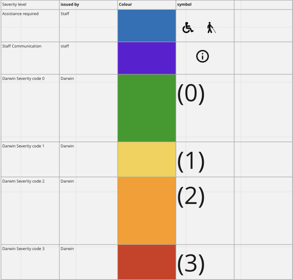
In order to have a consistent feel across all messages being Darwin, Tyrel, staff or messages raised from control we have created a set standard for all messages to follow. WACAG 2.0 guidelines state that if colour is signified to represent something it should be accompanied by something else. We have used symbols and a numbering system in conjunction with colours so that anyone suffering with a colour Deficiency can still clearly read the message. as a rule of thumb yellow messages which are minor (1) are usually 5-to-15-minute delays, Orange messages which are major (2) are usually 15+ mins and finally red which are critical (3) are cancellations. Staff communications would be purple with an information symbol. Blue is assistance with the VIP or wheelchair symbol supplementing it depending on who it is.
We created these standards as we believe at a glance user will know what the message is just by glancing at the colour and symbol.
Iteration 3
Design and feature Overhaul
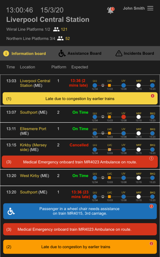
From rapid weekly iterations of sprints, we started focusing on the smaller details. Once we mastered the communications mechanism everything started to fall into place. With confirmation of the platform installation, we could instead of taking a count of the whole station we could verify specific platforms counts.
We added a notification bell for any messages or alerts or anything relevant to user to be notified here in a list format. This is just an efficient way of viewing information in a list format. We made the navigation bar sleeker and less loud improving the user experience.
Green and red Hues were made brighter to be louder towards the users’ eyes in order to stand out more as these are vital pieces of information. In addition to this on the trains progress map stations now show which are wheelchair accessible by being blue and the station names are now station codes. The number of messages against an incident are also available to see.
Scaling up to more stations and wider networks is another issue we have encountered in some stations multiple TOCs may pass through. In order to counter the confusion, we have added TOC codes to the service name; examples are (ME)MerseyRail, (NT)Northern Rail and (AW) Avanti Westcoast Mainline.
The next layer of interaction at viewing journey information was upgraded. A wider view of the journey progression you can now see the full train station names. The displayed message is further improved by having a button that acts as a signifier to be clicked on.
information board 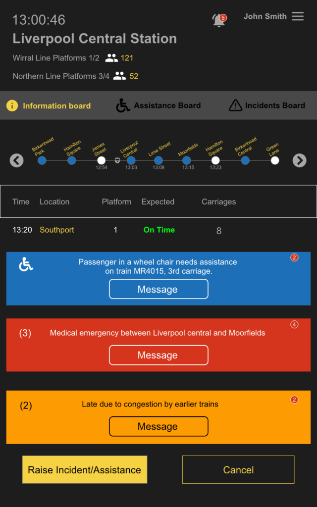
Selected journey
Verification
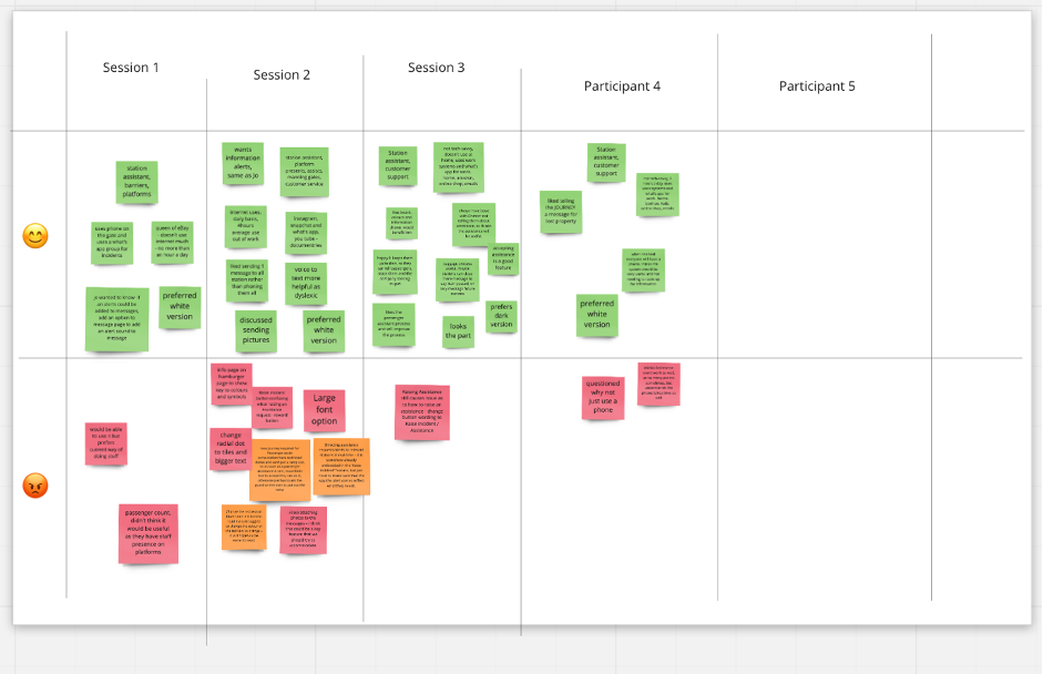
After numerous iterations testing with Mersey rail operational management, it was time to the testing on rail Due to covid we were not allowed to do user testing in person therefore it had to be held remotely. we had a script that was ready for to be followed as an introduction to what the project was. I would then ask the users questions regarding their experience with digital devices and services to understand the level of users they are. Users were given a list of objectives to try and figure out how to do each task.
While I asked the questions, my team would write down what they seen the users do and say as I asked them to think out loud while doing the tasks.
Overall testing was a success there was a few minor recurring problems, but they were very easily solved.
Impact
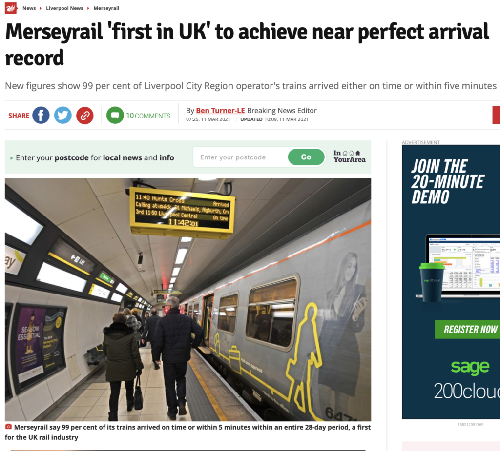
As a result we assisted Merseyrail by drastically improving operations during the trial period to a national record breaking 99% Punctuality of being on time. Although during Covid 19 the railways have been less busy which is another beneficiary factor for Merseyrail. The success of this service secured extra funding which has enabled much further development and improvement to take place. Further TOCs have become interested and the system is looking to expand.
Try the IRIS prototype
